Eduverse CTE Icons Concept Designs
These are a series of concept designs for icons to represent the CTE learning resources that were being introduced to the Eduverse+ content library on the ClassVR portal, namely sections featuring resources for Career Readiness, Career Exploration, Vocational Pathways.
The brief for the designs were that they should match or stick closely to, the style of the Steam3D, EduverseAI, Wildworld and CareerHub icons that were a part of the Eduverse content library, and not repeat any of the colours that those icons used for visual clarity. The icons were also going to be used in printed collateral as well as on the portal, so choosing colours that would not shift tonally from screen to print use was an important consideration.
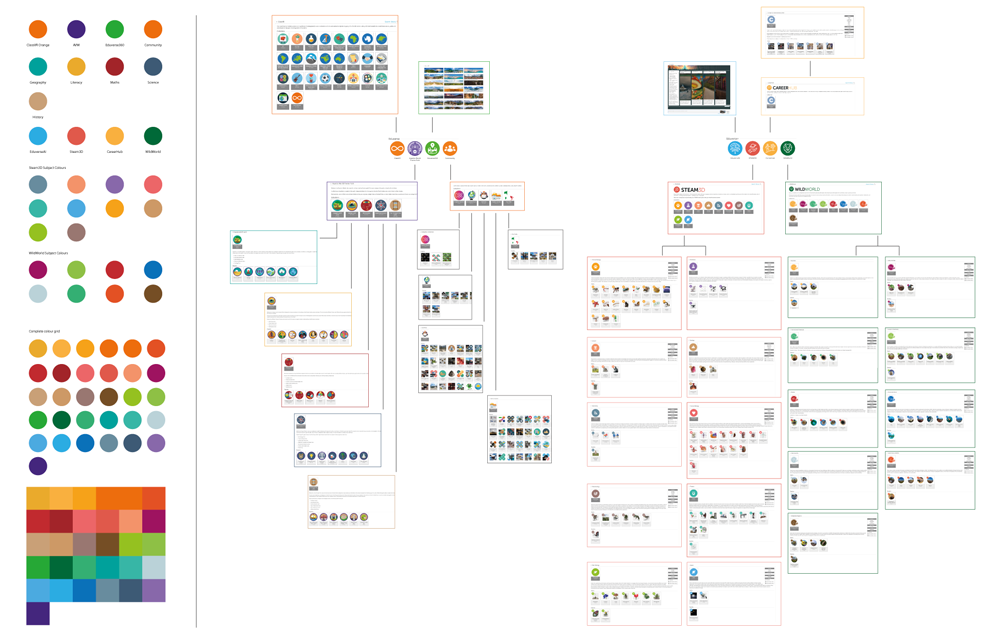
After some initial ideas, the first step, working with the marketing manager and CMO, was to draw up a hierarchy of the other icons in use on the ClassVR portal, what resources they featured, any icon designs that could be of use, and the main colours used in them.
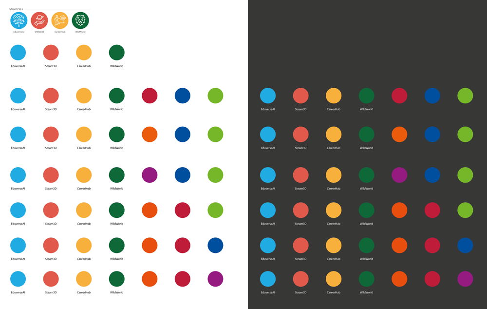
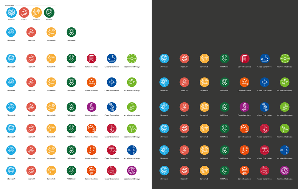
From there a board was drawn up looking at potential colours to use for the three new icons and to compare them to the existing Eduverse icons that they would sit alongside, and also try them on a black background to check that they would be legible against darker backgrounds, as well as concept icon designs.
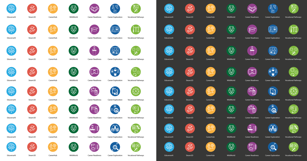
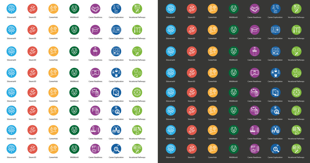
Different tones and saturation levels of the icon colours were then investigated along with a further range of potential designs, taking into account ideas and thoughts that myself, the marketing manager and CMO had with the designs.