Edibles Cafe Branding, Menus
& Promotional Items
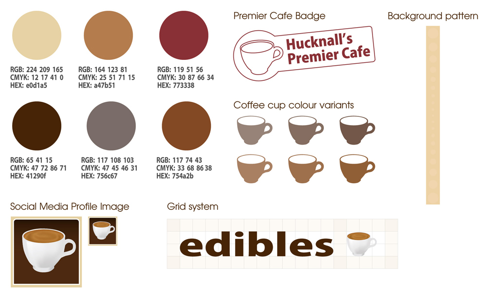
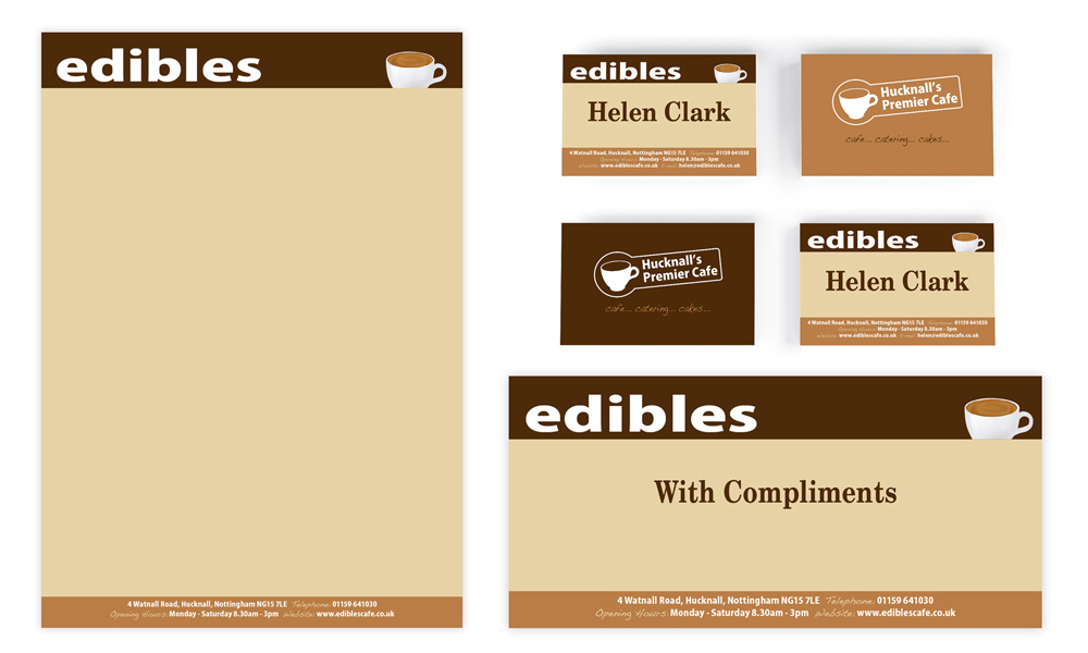
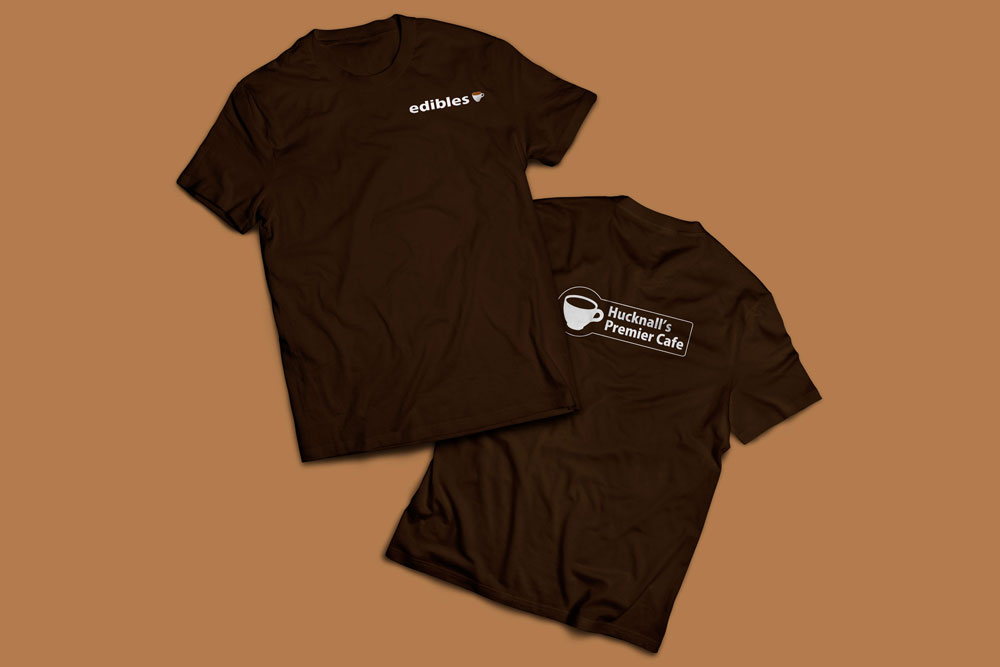
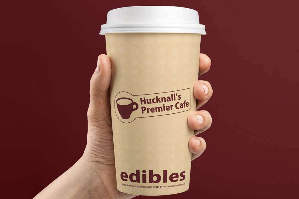
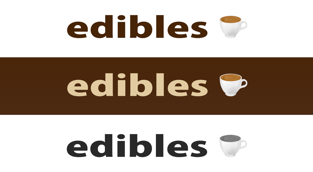
For this brief the cafe owner had fairly specific ideas about the style of typeface and the use of brown in the the logo, and that the logo should feature an illustration of a cup of coffee (which I artworked).
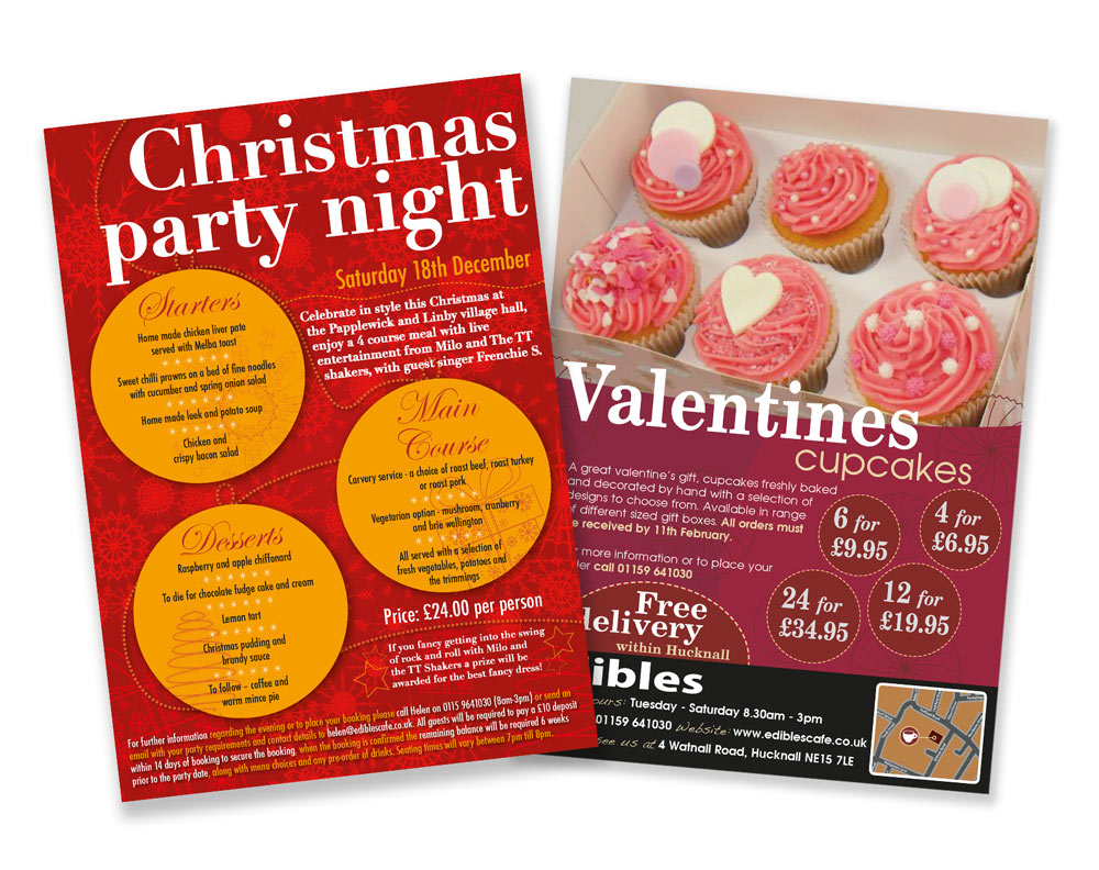
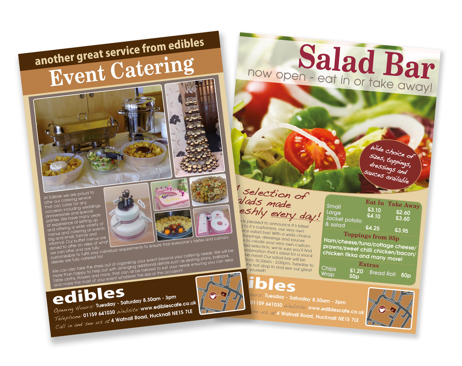
Aside from those points it was an open design brief, with the colour palette chosen to compliment the main brown colour of the logo and two other typefaces chosen to compliment the main typeface across the menu, flyers and other material for the cafe. Photography was supplied and artworked as required, and the website designed and coded by myself.